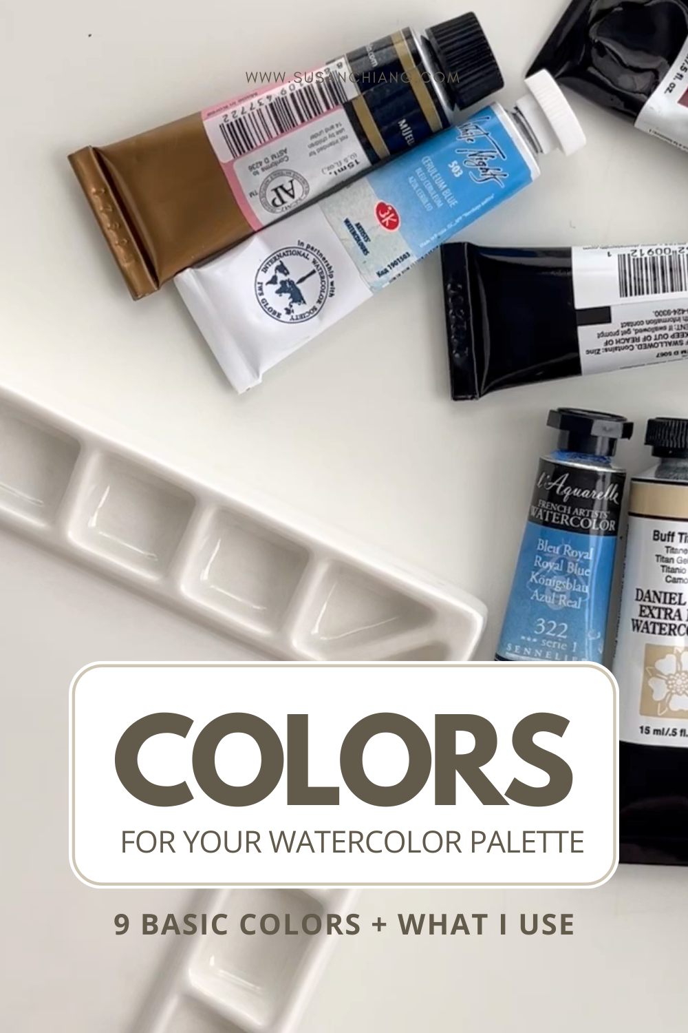
9 Basic Colors For Your Watercolor Palette
Before I dive into sharing my 9 core color suggestions for a basic watercolor palette, I just have to say that I don’t know if I believe there’s a so-called ‘perfect’ palette. There’s the palette that works for each of us as individuals based on our creative preferences, what we have access to, and how we like to work. And I think it’s important to remember those things as you build your palette.
By creative preference, I mean, for example: do you enjoy painting with clean, bright colors or muted, earthy tones? This could affect your paint color choices, especially if you build a limited palette. This may also shift and change over time, which means your color choices may evolve as mine have and will continue to.
Our palette choices are also influenced by what we have access to - whether it’s where we live, what supplies are available, or how much money we have to spend on paints.
And finally, we all have different ways of approaching painting. Some people love having a lot of colors on hand because they find it more convenient than mixing them, or simply because they love having lots of colors, while others prefer to work with a more limited palette.
All this being said, I’m not here to share the “right” or the “perfect” palette. I’m just here to share my color suggestions with you. I’m still very much discovering colors, exploring what I like (and don’t), and to be honest, I’m not sure if I’ll ever find that “perfect” palette because I’m not trying to find it.
So much of the joy I find when painting is learning, exploring, and staying curious.
Basic Core Color Groups
I’ve discovered that thinking about a basic core palette of colors using ‘groupings’ of colors makes the most sense - at least to me.
Here’s what I mean by groupings:
Primary Colors
Secondary Colors
Neutral & Earth Tones
Additional Colors
By selecting 3 colors from each group above, you have a 12-color palette.
In this blog post, I’ll take you through the 9 essential core colors that give you the largest gamut of colors. That’s just a fancy way of saying that it should give you a lot of potential color mixes.
Primary Colors
The primary colors are the first 3 color choices most people make when picking paints.
Some people paint with ONLY 3 primary colors. I’m not one of those people.
But I do think of the primary colors as the core triad for a basic palette.
Here are the 3 colors I use as my primary colors:
Yellow: Imidazolone Yellow [Holbein] - PY154
Magenta: Quinacridone Magenta [Holbein] - PR122
Cyan: Phthalocyanine Blue [M.Graham] - PB15:3
You might be wondering why I don’t use the traditional red, yellow, and blue as my primaries. In short, it’s because magenta and cyan (a blue that leans towards green) will result in more color mixing possibilities than red and blue.
I want my basic palette to have the ability to mix more colors rather than less. Bigger gamut, remember?
Secondary Colors
Secondary colors by definition are colors that can be mixed from the primary colors. So you don’t need secondary colors because your primaries can mix them for you.
I want secondary colors because (again) they will allow me to increase the gamut of colors I am able to produce.
Why? Because when you mix two paints, there is a ‘saturation cost’.
This is a fancy way of saying that when you mix two paints the resulting paint color will be less saturated (less bright/colorful).
By inserting secondary colors - I increase the opportunity to keep my colors brighter and have more color possibilities when I mix them with other colors on my palette.
Here are my secondary color choices:
Red-Orange: Pyrrol Orange [Daniel Smith] - PO73
Blue-Violet: French Ultramarine [Daniel Smith] - PB29
Blue-Green: Viridian [Mission Gold] - PG7
With these 6 colors, you have what you call a secondary palette (By the way, I learned this from handprint.com - worth checking out if you want to dive deeper into color theory)
Dark Neutral & Earth Colors
While a secondary palette is great, it leaves a gap for me - getting desaturated colors easily and more earthy colors. While I love a bright palette, I also want to be able to have nice earthy tones.
This is where I like adding in a dark neutral and two earth tones:
Dark Neutral: Neutral Tint [Daniel Smith] - PBk6
Earth Red-Orange (Brown): Burnt Sienna [Daniel Smith] - PBr7
Earth Yellow: Monte Amiata Natural Sienna [Daniel Smith]- PBr7
Complete List: 9 Colors For A Basic Watercolor Palette
In summary, here are the 9 colors I think are essential for a basic/core watercolor palette:
Primary Colors
Yellow
Magenta
Cyan
Secondary Colors
Red-Orange
Blue-Violet
Blue-Green
Dark Neutral & Earth Colors
Dark Neutral
Earth Red-Orange (Brown)
Earth Yellow
You don’t need to get the exact paints I listed above, but I hope this list guides you as you build your palette of core colors.
Expanding Your Palette to 12 Colors
The 9 basic colors above should get you pretty far in terms of how many colors you can mix from them. However, a 12-color palette is quite popular to have. If you’re looking to add another 3, I have found that it makes sense for me to add any “missing” colors or holes that I feel I have.
You can add whatever you like, for example, colors you want to experiment with or something you feel is missing.
Here are my additional colors:
A deep yellow
A deep red
Another green (or blue)
I hope this post has been helpful and provided you with a bit of guidance in building your palette!
If you liked this post, then you’ll find this accompanying video helpful:
I also made a FREE easy-to-reference guide to my 12-Color Palette

Get a convenient list of my 12-color palette colors
Grab link to the exact paints I’m using + an alternate option/example
Use it as a guide to build your own palette